On the hill overlooking the port of San Juan is this old gate, next to Parque de las Palomas (which, as the name suggests, was teaming with hundreds of pigeons). I was there too early in the day to catch the lunch crowd. Had I been an hour later, this street would have been as bustling as the park.
Willemstad's Floating Market
Up the river from the pontoon bridge in Willemstad is a floating market where boats dock to sell their wares. Many of the vendors are Venezuelans who sail the 18 miles to Curaçao.
The Pontoon Bridge in Willemstad
I love Willemstad. I think that its prominent Dutch influences and its Caribbean situation make it an ideal place to paint. The pontoon bridge swings open to allow ships up the river — I've never seen another bridge like this. My sketch was a bit tricky because of the extreme value contrasts — the dark reflections on the water contrasted with the bright colors of the gabled houses and sky.
First Time in Antigua
My first time to Antigua I saw an island still recovering from the hurricanes. My favorite spot was the cathedral and its graveyard where headstones dated to the 1700s. There was a lot of construction going on — renovations/improvements to the church — and I found it impossible to find something I wanted to paint there. But this area near the docks was colorful, shady and lively.
A Lovely Place to Visit
St Thomas had incredibly clear blue water. Everything there was blue or shades of blue and green. I loved the pops of orange here.
El Morro! Quite the Fortress!
San Juan is one of my favorite places in the Caribbean. The locals are as wonderful as the old town is beautiful. El Morro is an imposing structure overlooking the city and the sea. This tiny sketch (5 x 3") doesn't do the architecture justice.
Off the Beaten Path
At the time I did this sketch in Key West, this side street was screaming to be painted. But when I was nearly finished, I realized that there were no people to be seen — something strange in a place as lively as Key West.
Cruising the Caribbean
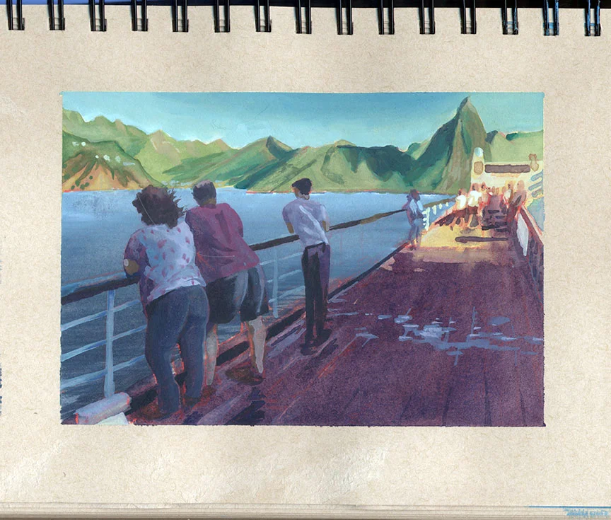
Over the holidays we went on a two-week cruise in the eastern and southern Caribbean. While the cruise was fantastic, the best part about it was having time to do some painting. This sketch was from the upper deck of our ship as we sailed through St. Lucia's Soufrière Bay. The sun was setting, warmly illuminating the island and casting deep, cool shadows on the folks leaning over the railing.
It Rose from the Reeds
I love doing illustrations for Cricket Magazine! Thanks, Anna, for offering me this month's cover!
The wrap-around completes the image. You'll have to pick up your own copy to see how the narrative continues on the inside! Here's the black and white pencil sketch I submitted before doing the final art:
Missing Mitla
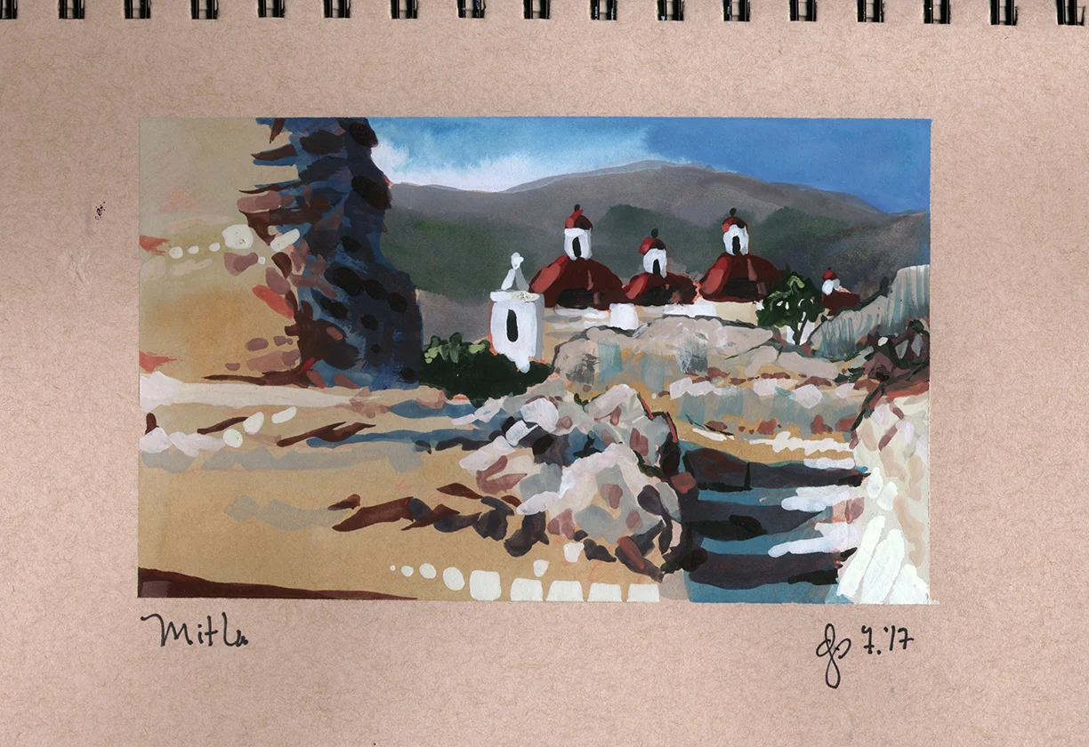
It's been way too long since I've been back to Oaxaca. Mitla is a beautiful town with colonial Spanish architecture and Zapotec ruins.
Long Shadows in Lübeck
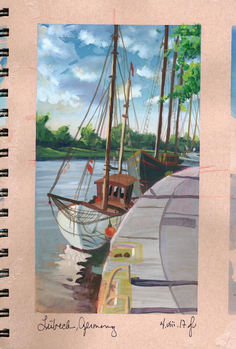
Lübeck is an incredibly picturesque town. Nearing sunset the colors were intense and the shadows long.
Hamburg Waterfront
Hamburg is a bustling place! I loved the contrast of the dark, burgundy-red bricks against the blustery blue-grey sky.
German or Polish?
I had the good fortune to travel to Góra, the town my grandmother's family left when they emigrated to Michigan. They spoke German while some of our cousin's families spoke Polish. The nearby Rheda River served as the boundary for early partitionings of Poland. Grandma was being diplomatic when she told me that we were Prussian.
Nine Dollars a Cup
When sketching in Gordes, I popped into a cafe for something to drink and paid a whopping 6€ ($9!) for a cup of coffee! While still beautiful, Gordes has become too expensive for my taste!
November Morning on Turner's Creek
What a boon to be able to do sketches like these here in my own stomping ground!
My 2 x 3" value sketch
Small gouache sketch using vermillion, Payne's gray and white
Full-color gouache sketch of Turner's Creek, separating Wilmington from Whitemarsh Island
Angoulême
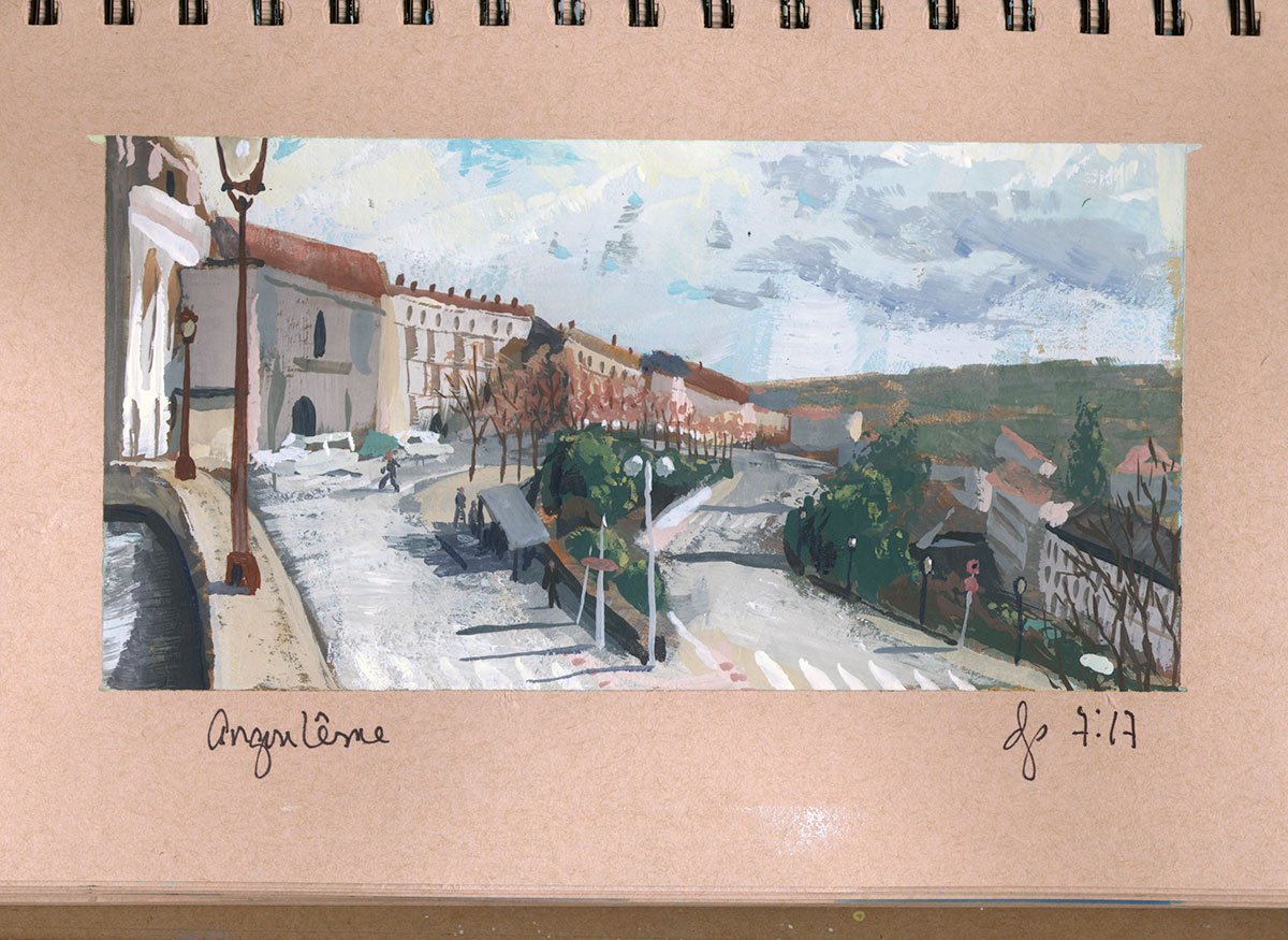
The Festival de la Bande Dessinée in Angoulême was great, but so were the views throughout the town.
Layers
I loved the receding planes and soft colors in Fontaine-de-Vaucluse.
Towards Dusk in Provence
The light in the valley between Lacoste and Bonnieux was gorgeous.
Fletcher Who?
This term I am teaching Color with Intent. While we're looking at all sorts of facets of color theory and application, one of the things we're doing is looking at Frank Morley Fletcher's color system. Fletcher approached color like music, suggesting that palettes should be limited to a specific "key," one based on intervals around a twelve-hued color wheel the same way musical keys are based upon specific intervals based on a chromatic scale.
While I was familiar with Fletcher's theory, I never actually applied his theory to my own work. Here is my first attempt as applying his color system to a sketch of the Dachstein Massiv in Austria.
I did it in the "key" of "yellow clockwise," or "Y>," the main color triad of which is yellow, blue and red-violet; primary accents are red-orange and green; complements are yellow-orange and blue violet:
Fletcher's premise (if I understand it correctly) is that while the three colors of the primary triad can be combined to create the darkest neutral, any other color mixing must be done only with colors immediately adjacent or nearly adjacent to one another on the specific color wheel. This limited mixing prevents "promiscuous color mixing" (Fletcher's words, not mine), while ensuring color harmony.
While I stuck to these parameters when mixing my color, my specific application of color may have been "promiscuous." I layered up color, doing underpaintings with temperatures contrary to the final color temperatures I was working toward. In other words, I ultimately wanted the distant mountain ridges to be cool and the foreground ridge to be warm, so my underpaintings were temperature opposites — warm distant ridges with a cool foreground. In layering up my color this way, I combined colors across from one another on my color wheel, not adjacent to one another.
But before thinking about color or temperature, I start with a little value sketch.
Then I sketch out the image using Prismacolor — in this case on recycled paper.
The following are the steps I used to build up color in ways to add a translucent richness to the final sketch.
The Fish Who Shook the Earth
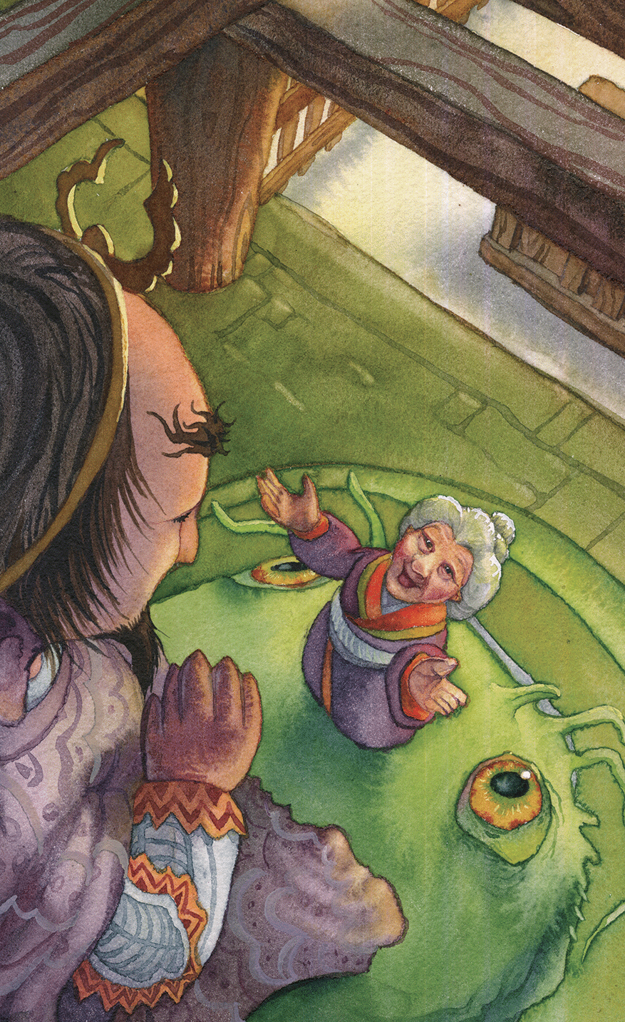
I recently had the good fortune to illustrate a Japanese folktale by Rachel Craft for Cricket Magazine for their November/December issue. Here are a couple of the watercolors I created.
